

Brand Identity
Symphony
The brief
Build a complete identity for Symphony, a luxury residential development, from a single brandmark through to the objects people would actually hold.
- The idea
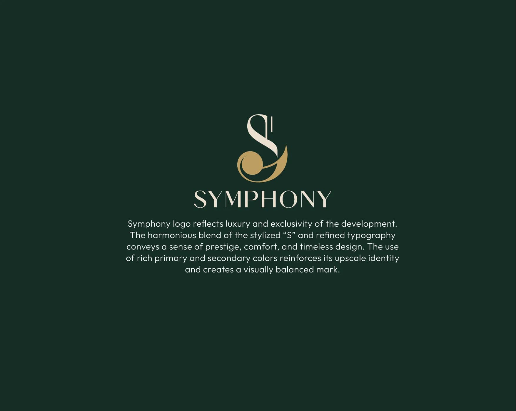
- A stylized "S" that reads at once as a musical note and a wave, so the mark carries harmony and movement before anyone reads the name.
- The system
Brandmark
A stylized "S" blending smooth curves with a gold accent.
Logotype
A sleek modern serif that carries the mark's formality on its own.
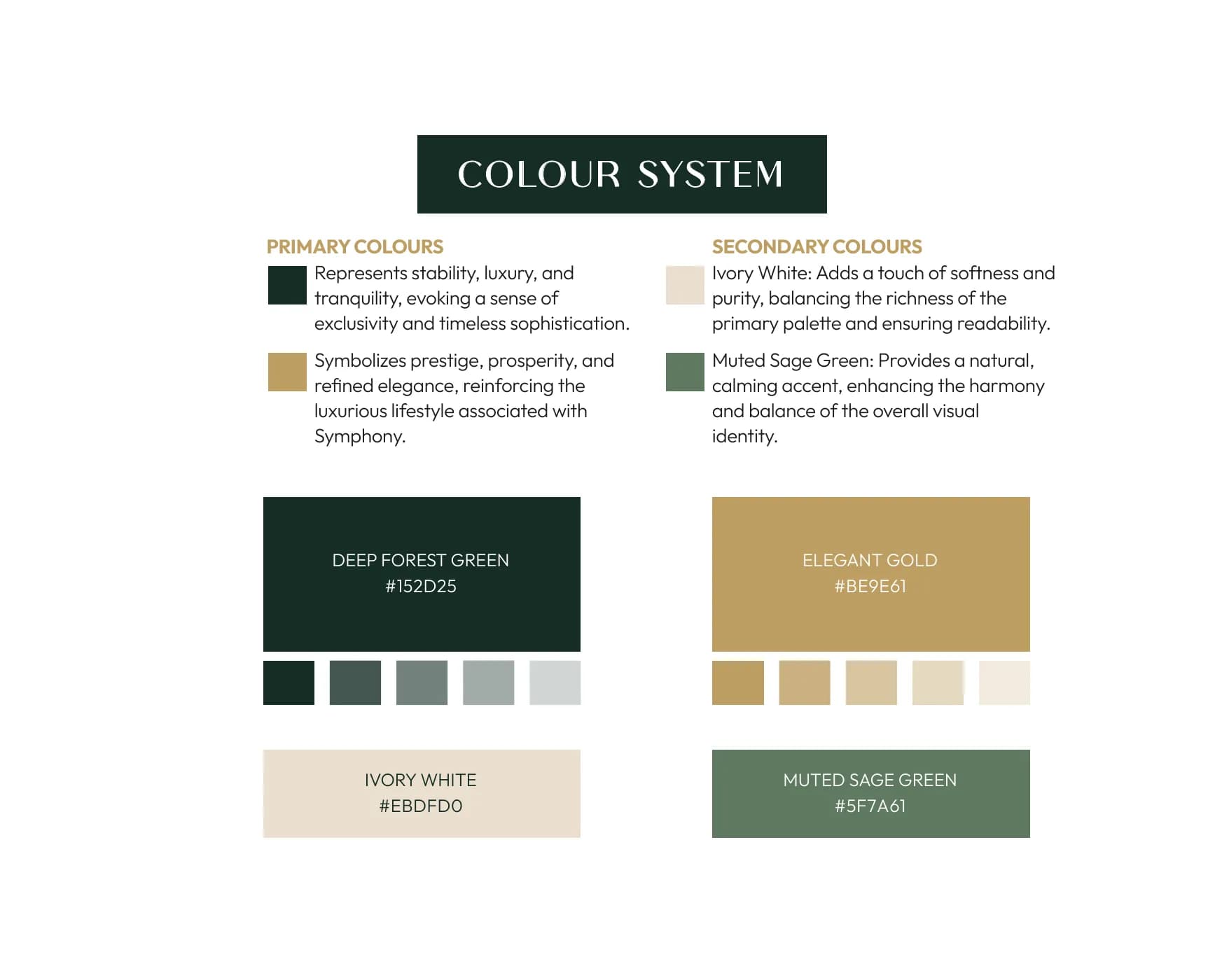
Colour
Deep forest green and elegant gold, with ivory white and muted sage as support.
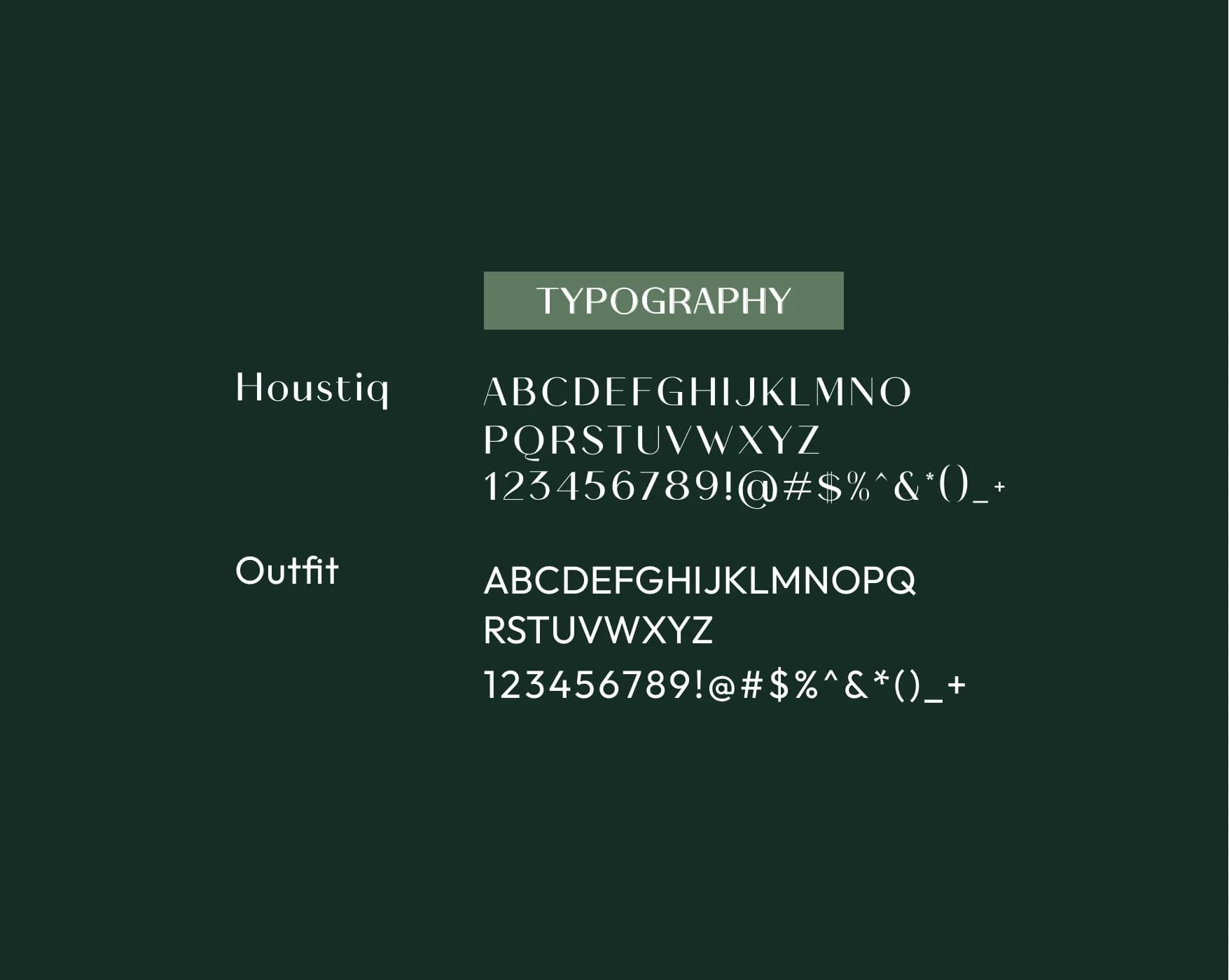
Typography
Houstiq for display, Outfit for text.
Applications
Where it shipped.
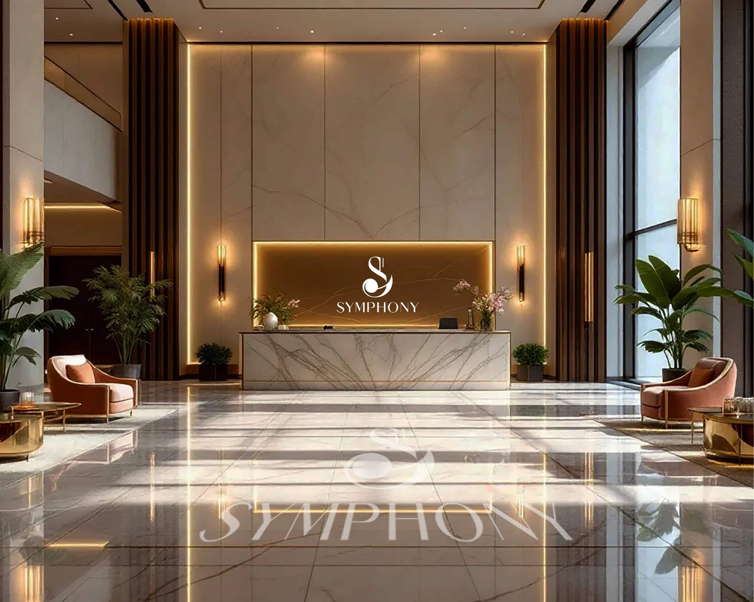
- Reception signage
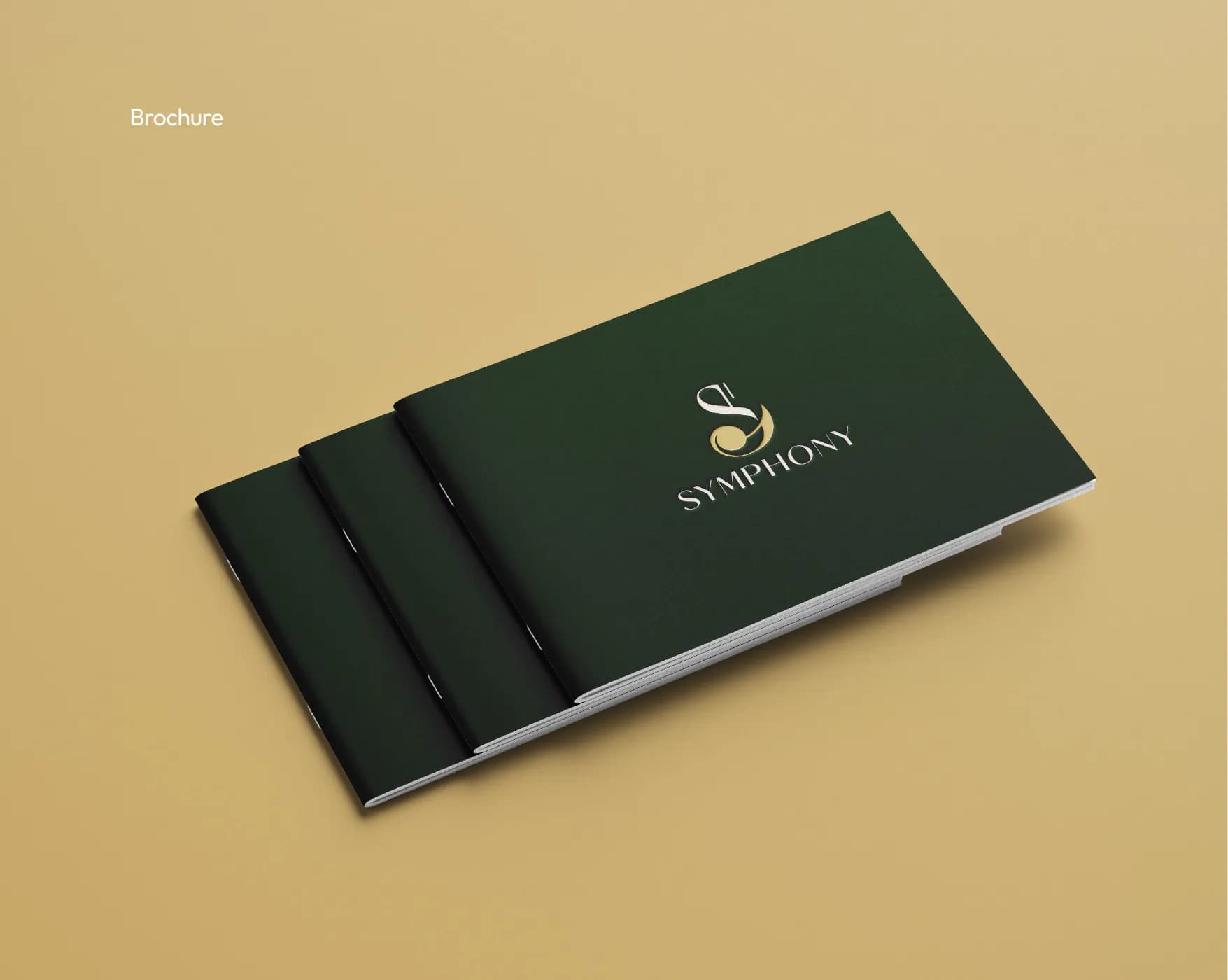
- Brochure
- Mug
- Pen drive & key tag
Want numbers like these?
Start a project